This Page Has A Two Column Layout
The two columns are created by placing <section class="leftcol"></section> and <aside class="rightcol"> </aside> on the page. These go after the <article> tag. Just view the source code of this page to see that.

If you are wondering why we use <section> for the left column, and <aside> for the right, there are two reasons.

The first is for Search Engines. They recognize that <aside> indicates that while the content will probably be related to the main article, it is not a neccessary requirement to have it. In other words, it is likely to be things like adverts, banners, testimonials, supplementary navigation, things like that. So they direct their indexing efforts towards the "meat and potatoes" of your content, which is contained in the main <section class="leftcol"></section>
The other reason, is related to the print view. When somebody is going to print out your page, they probably want just the main article. They are not interested in headers, footers, nav or whatever is contained in your side column. So this is hidden in print view.
Example of a callout box, that has a floated image with some text. Notice that the box is "self-clearing" so that the contents are fully contained within the border.
Floated images in the box are automatically constrained to be no more than 50% of the width.
Galleries On A 2 Column Layout
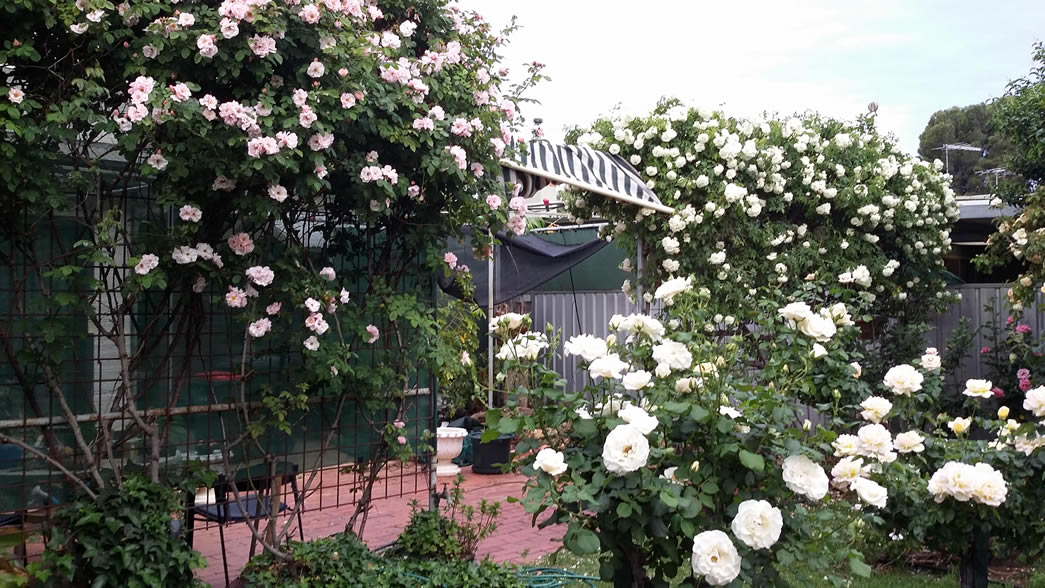
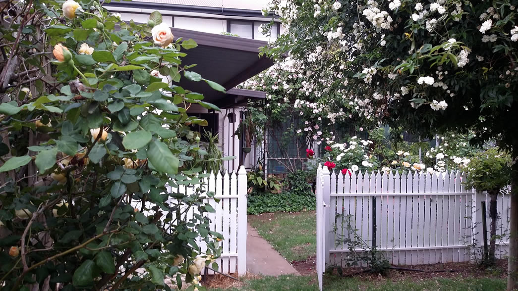
As our left column is not as wide as the single column layout, we can expect the gallery images to display differently (we don't have the same gallery width). But no problem, the galleries will organize the image to suit, and display as many across the page as will fit, and center any part row at the bottom. All 3 gallery sizes are shown here, holding the same ten pictures.
Large Sized Thumbs Lightbox Gallery


Medium Sized Thumbs Lightbox Gallery
Small Sized Thumbs Lightbox Gallery
The right column will of course display as you would expect in mobile view. That is: block level full width, stacked below the main content and above the footer.
The Right Column
As many people use mediaVine for advertising, the column width is fixed to remain at 330px wide (they require a minimum of 300px). This is comprised of 10px left and right padding with the remainder as usable width. Plenty of space for a MediaVine advert.
if you slowly reduce the width of your browser (assuming you are viewing this page in desktop view) you will see the left column gradually decreasing in width, with the right column remaining static.
Once the large tablet breakpoint is reached (set at 800px rather than the traditional 768px wide to cater for devices such as the Samsung TAB series), then the right column become block level, positioned below the main content. Any content or boxes in the right aside column will float left if there is enough width to display 2 abreast. At the 560px breakpoint (just above the width of an iPhone 6+) the column boxes will display block level centered on the screen.