Trials
This page contains any trials that might be in the works. The first one is a full screen gallery. Unlike the 3 image galleries that stretch a particular width beyond the container boundary, this takes the gallery to the full width of the page, no matter how wide that might be.
On a 1280px res monitor, the gallery will be 1280px wide. On a 1680px monitor, it will be 1680px in width, and as many of the images and boxes as possible will spread across the rows of content. That might be as low as only 1 on a mobile, perhaps 6 or more on a big screen. the browser will decide how many can fit. And like the standard galleries, the rows will "self center".
Full Pagewidth Gallery or Image
Used for layout out of content such as images or text and image boxes in a grid style. This can also be used for a full screen image. Below is an example that has a wide image at the top (picture is 1794px in width), followed by a number of smaller images and text/image boxes of varying heights. The full width area has been given a dark background to more easily show paddings and margins.
This is not suitable for use on a 2 column layout, and should be reserved for single column pages only.
How This Works
To place something beyond the width of the containing element (the main container which is 1100px wide and centered) we need to use something else instead for our baseline width reference. Obviously, just applying something like width:100%; to the full width gallery will only stretch that out to 1100px - minus any padding.
Instead, we use the css vw property to get the 100% width. Then we are able to move it to 50% from the left edge of the screen, and then pull it into place using a negative -50vw. This gives us a section that ignored the main container width, and is the exact width of the screen. All without having to know any px widths of things like viewport or containers. It will adapt atomatically as screen size shrinks or increases.

You can put some text into this full width gallery, like this. If you apply the class of "full-width-text" to the p tags then the color can be set (in this case white) and the width of the paragraphs set as well. This one is a max-width of 800px.
This is a text box placed into the full width gallery. It contains a bit of text, but you can also add an image to it if you wish.
This is a text box placed into the full width gallery. It contains a bit of text, but you can also add an image to it if you wish.
This is a text box placed into the full width gallery. It contains a bit of text, but you can also add an image to it if you wish.
This is a text box placed into the full width gallery. It contains a bit of text, but you can also add an image to it if you wish.
This is a text box placed into the full width gallery. It contains a bit of text, but you can also add an image to it if you wish. Image is shown below, which you could also turn into a lightbox image.
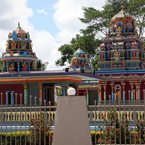
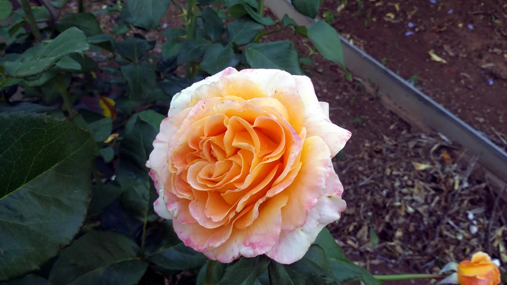
While this will look at its best when images are all the same size, the full width gallery is forgiving enough that it will adapt to whatever size pictures you choose to put into it. Same with the text boxes, those can contain as much content you wish, with no problems in the display. Images in the text boxes will automatically shrink to fit the box width, and images placed into the <figure> tags will be contained to a maximum width of 255px.
If you want your image to stretch the full width of the screen (or as wide as the image is, whichever is smaller), then just add class="wide" to the figure tag. Figure tags without that class will be constrained to the 255px max width.
If you prefer different sized boxes and images, then the appropriate classes are changed in the stylesheet, you can change the default px widths to whatever you want, and the fullwidth gallery will adapt.
This will also print out nicely. Try it by clicking the print button below.